Deliberately Boring by Design
In a portfolio full of playful apps, we intentionally made something that feels like a government report. Here's why rejecting every modern app design pattern was the most interesting decision we made.
Every app I’ve built at Stalefish Labs has personality, and the underlying purpose of each has usually tilted toward fun. Ridewise transforms weather data into trail conditions to get you outside riding with friends. Muster in many ways acts as a session-based Instagram for helping people get together and share experiences. Even a smaller web experiment like the Jump Simulator, which is fundamentally a physics calculator, has ghost trails and animated motorcycles flying through the air. It’s kind of a modern Fuji Hakayito that hopefully doesn’t lead to epic jump fails in real life. What I’m saying is I like making things that are fun to use.
The Citizen’s Daily Brief has none of that. And it’s the most interesting design decision I’ve made.
The Anti-Pattern Pattern
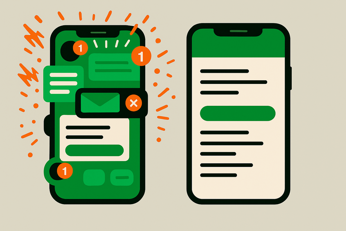
Open the Daily Brief and you’ll find a single column of text on a near-white background. Serif typeface. No hero images. No cards with rounded corners and subtle shadows. No gradient accents. No animated transitions. No skeleton loading screens. The whole thing looks like it was printed on government letterhead and scanned to PDF, except it’s implemented as a website and iOS and Android apps.

The toned-down design wasn’t laziness or a placeholder that stuck. Every element of the design is a conscious rejection of something.
No personalization. Everyone gets the same brief. Your brief is my brief is everyone’s brief. There’s no algorithm deciding you care more about tech than foreign policy, no engagement model learning that you linger on economic stories. One brief, one audience, one shared reality. No personalized information bubble.
No engagement optimization. Nothing is designed to keep you on the page. No related stories sidebar. No “you might also like” recommendations. No notifications begging you to come back and stay a while. The ideal user session is: open, read, close, go live your life.
No hero images. News images are editorial choices disguised as objectivity. A protest photo can frame the same event as righteous or chaotic depending on the shot. The brief has no images because images are opinions wearing the costume of documentation. Text forces you to engage with what happened rather than how a photo editor decided it should feel.
No infinite scroll. The brief has between five and seven items. You read them, and you’re done. There is no “more content below the fold” because there is no fold. The brief is finite. There’s one a day, and each one ends. That’s the feature.
Why Boring Is the Point
The aesthetic isn’t arbitrary. It’s a big part of the idea.
The Citizen’s Daily Brief is modeled on the President’s Daily Brief, the intelligence document delivered to the U.S. President every morning. The PDB isn’t designed to be engaging. It’s designed to be trusted. It communicates through structure, precision, and restraint. It says: this is what we think you need to know, this is how confident we are, and this is what we don’t know. The format is the credibility.
When I started designing the CDB, I prototyped a version with visual cards for a nicer layout. Each brief item was a styled card with a topic tag pill, a headline, expandable sections, and a colored confidence indicator. It looked like a modern news app. It looked great. And although it was pretty, it felt completely wrong.
The visual polish created an expectation of entertainment. I worried readers would approach it the way they approach any well-designed content feed — skimming for what catches their eye, looking for the most interesting card, treating it as a buffet. But the brief is a checklist. Every item is there because the system carefully determined it matters, and the order is the order of significance. Skimming defeats the purpose.
The institutional aesthetic solves this. When something looks like a government report, you read it like a government report. Top to bottom, item by item, with the implicit understanding that someone (or in this case, some thing) already did the work of deciding what matters and in what order. You’re not browsing. You’re being briefed.
Fonts for Comprehension
The typeface choice tells you everything about the intent. The body text is set in Georgia, a serif face that says “document” and “permanence.” It’s the typeface of printed reports, academic papers, and the kind of writing that expects to be taken seriously. Almost every modern app and news site has moved to sans-serif faces — Inter, SF Pro, Roboto — because they feel clean, fast, and contemporary.
Georgia feels slow. That’s the point. You read Georgia at the speed of comprehension, not the speed of scrolling.
The metadata — topic tags, dates, confidence labels — uses a sans-serif. This creates a visual hierarchy that separates the institutional voice of the assessment from the mechanical voice of the system’s metadata. The brief items speak in Georgia. The scaffolding speaks in sans-serif. When content is stripped bare, you process it differently without thinking about it.
The Color Non-Palette
The CDB uses exactly two colors: near-black text on a near-white background, with a single accent of slate blue for interactive elements and topic tags. Not pure black on pure white (that’s actually harder to read), not the warm off-whites that lifestyle brands use, and certainly not a kaleidoscope of dopamine-grasping color. The CDB uses a cool, institutional near-white that reads as “official.”
The slate blue (#2c4a6e) was chosen specifically because it’s boring. It doesn’t evoke tech (that would be a brighter blue), it doesn’t evoke urgency (that would be red), and it doesn’t evoke nature or wellness (that would be green or teal). And I’m a guy who can’t get enough earth tones, but I wanted a “just the facts” look here. So it evokes… filing cabinets. Government websites. The blue of a seal on an official document. It’s a color that communicates authority through its complete lack of personality.
There are no gradients. The brief items cast no shadows. No color-coded categories. The trust signal indicators use bars rather than color alone, because one of the accessibility rules I follow is never relying solely on color to convey information. But even without that rule, I’d have avoided it. Color-coding news categories is an editorial choice — it teaches readers that “politics” is red and “technology” is blue, creating categorical associations that the brief deliberately avoids.
What It Costs to Be Boring
Oddly enough, I learned that restraint is more work than expression. Every modern CSS framework, every component library, every design system is optimized for making things look polished and engaging. Building something that looks deliberately institutional means fighting your tools at every step.
I stripped the shadows off the brief items that carried them by default. I overrode the border-radius values that rounded the reading surface automatically. I resisted transition animations that made elements fade and slide. I kept links to a quiet treatment: slate blue, underlined on hover, with none of the sliding underline animations modern sites layer on. The short timeline of dated developments that runs under each brief item reads as plain monochrome dots, not the colored, animated progress rail the component shipped with.
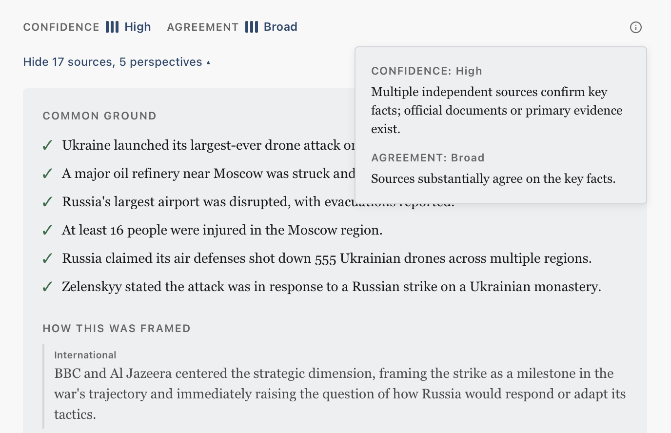
The evidence panel — the expandable section under each brief item that shows its sources, how strongly they agree, and how each camp framed the story — was the hardest to keep boring. It’s full of data that begs to be charted: confidence and agreement levels, source counts, a breakdown of framing across the spectrum. Every instinct says to make these visually rich. Instead, they’re rendered in the same institutional style as everything else. Simple bars. Plain checklists. Labeled paragraphs. The data speaks for itself without visual embellishment telling you how to feel about it.
The Contrast Is the Brand
Here’s the thing that makes all this work: the Citizen’s Daily Brief exists in a portfolio alongside apps with personality. Open Wheelers has fantasy F1 animations and visual stats that show which drivers have scored you the most points and where your picks overlapped with rival managers. Muster has interactive in-or-out declarations and post-session media sharing and comments. The Ramp Designer has a 3D rendered skateboard ramp you can flip, spin, and explode. Sojourn paints a rich, layered bedtime storytelling experience complete with reader-triggered audio foley effects and subtle fireflies lingering in the interstitial animations. When someone discovers that the same studio made all of these things, the CDB’s austerity becomes a statement rather than a limitation.
It says: we know how to make things engaging. We chose not to. And that choice is itself the most engaging thing about the product.
The design philosophy is countercultural. In an attention economy where every app fights to monetize your time, the CDB is designed to give your time back. Most products signal credibility through visual sophistication; this one earns it through the quality of its assessments and the transparency of its reasoning. The design world’s highest compliment is “delight.” The CDB aims for something rarer: trust.
Restraint is harder than flourish, and for a product asking to be trusted, it’s the whole job. The brief shows up, tells you what it thinks you need to know, and gets out of the way. Then it waits until tomorrow.
The Citizen’s Daily Brief is a free daily intelligence briefing from Stalefish Labs.
Want more like this?
Subscribe to get new posts from the lab delivered to your inbox.
or grab the RSS feed